Sunday, 22 May 2011
Advertisement
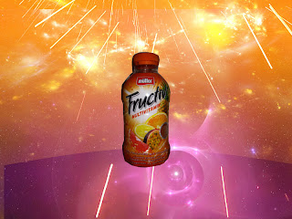
By following the tute I was able to create this image. I played with all the different affects until i found one that i liked. This was a great tute which helped me really understand photoshop.
Design Brief
Design Brief
Pictograph Map
Mobile hand-held map of Melbourne Sporting District
Time frame – This should be completed in 4 weeks
Aim – To create a mobile map that can be used for tourist and sports fans when visiting the Melbourne’s sporting district. I want this map to be easy to read and understand while providing users with the most information possible. Objective – The objective of this map is in assist tourist and fans with direction when visiting the sporting district. With this map people should be able to make there way though the sporting district with minimal fuss. They should be able to identify all the public transport areas and all the food areas. The map can be translated to accommodate all tourist visiting. Hopefully this map assists people who are travelling to Melbourne’s sporting district
Target Audience – The target audience for this map are tourist wanting to see the sporting district and sporting fans traveling to one of the many stadiums in Melbourne. The age will vary for 16 – 80 year old people.
Things to be included – This map will be used be people of all ages and also all languages. It needs to be easy to read and accessible. The information that should included are:
· Different Language
· Toilets
· Parking
· Tram and Train Lines
· Taxi Ranks
· Street Names
· Stadium Names\Entrances
· Restaurants\Cafes\Eating areas
· Merchandise stores
· Disability Access
Use the following pictogram picture format to identify these areas. The following link will assist you with any other ideas you may have but ideally Try and keep the format shown.
http://www.google.com.au/search?q=pictogram&hl=en&client=firefox-a&hs=3zo&rls=org.mozilla:en-US:official&prmd=ivns&source=lnms&tbm=isch&ei=L5TQTe2ECYPRrQf_qPHCCg&sa=X&oi=mode_link&ct=mode&cd=2&ved=0CBcQ_AUoAQ&biw=2560&bih=1199

Set Up – The way I want this map to be set out similar to the map below

I would like the stadiums to be in different colours so they are easy to identify with the entrances clearly marked; public transport access should all be the same colour (make sure that trains, trams and taxi ranks are clearly marked.); Street name are visible and clear, Parking and Toilets areas easy to read, Restaurants\Cafes and eating areas are shown and a key so people using the map know what each symbol is. I would like there to be a feature where users can press on the pictogram and information on the icon comes up. For example each café or restaurant and it will show what foods are served, Taxi ranks with the photo number of the taxi company etc. Finally users of the map should be able to zoom in and out of the map.
Sunday, 15 May 2011
Social Conscience
The design I have decided to research is war. I wanted to do 2 posters that are simple and easy to read so the readers can understand the message without having to think too much. I hope that the idea that war is not the answer and that it is not a game really stands out. The first one promotes peace. I used vibrant and bright colours to really catch the eye to show the happiness. The second one I kept really dull and plan. I want whoever is looking at this poster to know that nothing good can come from war. I have included a quote from Leo Tolstoy to share his opinion on war.
A line and a dot\Motion
Motion
This is an exercise on motion sequence. The red, green boxes and the title will move around the screen. This is a great way to show motion and movement in photoshop. Surprisingly very easy to do once you get the hang of it.
Pen Tool
This is the pen tool in photoshop. We practiced using this tool by tracing over line and bending and curving them over the lines. It was a great help and will help me in the future when tracing or drawing an image. A great tool on photoshop.
Monday, 4 April 2011
Music Cover
Music Cover
I created this Album Front and Back cover using different layers. I added in text boxes on different layers so I was able to create the effect I wanted and move the font where I wanted. I also added in a gradient to really finish of the cover.
Sunday, 3 April 2011
Week 6 - Rainbow/Gradient
Using different gradients and colors i was able to create this background and picture of a rainbow. I added in a text box to write the title DANCE.
Thursday, 17 March 2011
Rubbish Font
'RUBBISH' FONT
This font I created using a range of different sports stars. Each of the letters were created on an image of a different sports star. Like the example in week 2 I used the cropping tool to create all the the letters.
Rob Tarzia
This font I created using a range of different sports stars. Each of the letters were created on an image of a different sports star. Like the example in week 2 I used the cropping tool to create all the the letters.
Rob Tarzia
Sunday, 6 March 2011
Week 2 - Cropping
Week 2 - 07/03/2011
Do create this picture I selected 2 pictures for the internet and used photo-shop to create it.
I first selected the picture of the player, cropped and deleted the background he was originally on. Then opened up the field on a second layer. I then dragged the player onto the field layer and created my football picture.
Subscribe to:
Posts (Atom)


